Using CDF Plots
Governments; ISPs
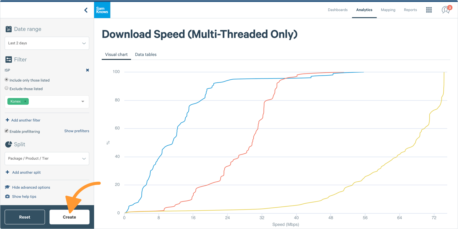
CDF (Cumulative Distributed Function) plots show the cumulative distribution of measurement results. The shape of this curve allows you to identify patterns in the data (e.g. step changes indicate a clustering of results around certain values) and also to immediately recognise whether performance is normally distributed among users or not.
Creating a CDF Plot
1. To create a CDF plot, go to the Chart Builder to the left-hand side of your screen. In Analytics, select CDF Plot in the chart section.
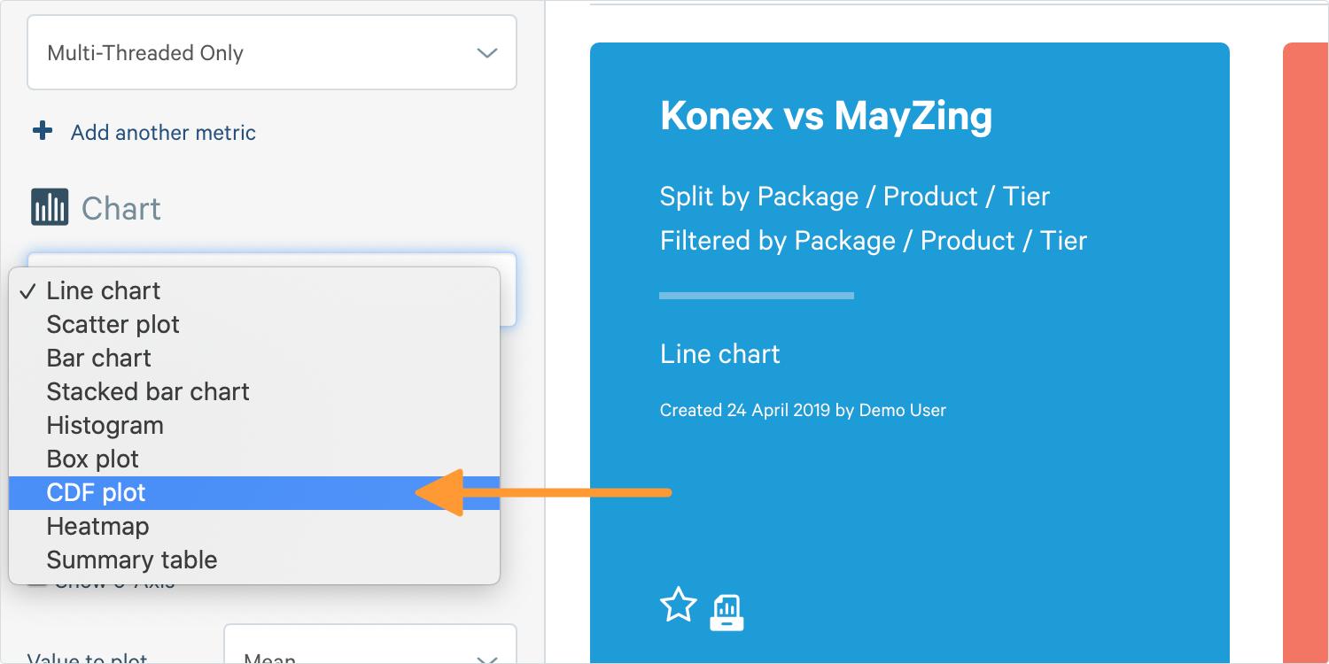
2. An additional option will appear, asking if you wish to draw a tail distribution. A tail distribution inverts the CDF plot and shows you the percentage of users that received a certain value or higher, instead of the percentage that received the x-axis value or lower.
Tip: Splitting is also available on scatter plots and will result in colour coding points according to the data series they belong to.
3. Complete the other options and click Create.
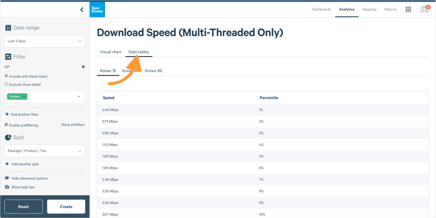
Data Tables
In addition to plotting your data as a visual chart, you can also create a table. Tables allow you to include additional aggregate functions.
1. Where you see Visual Chart at the top, click Data Tables and a table like this one will appear: