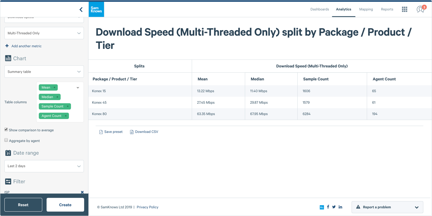
Using Summary Tables
Governments; ISPs
This guide will show you how to create and use a summary table, perfect for comparing the averages and / or other values of different data series. The y-axis displays the value being plotted, and the x-axis displays the split of the data that each bar represents (e.g. product).
Creating a Summary Table
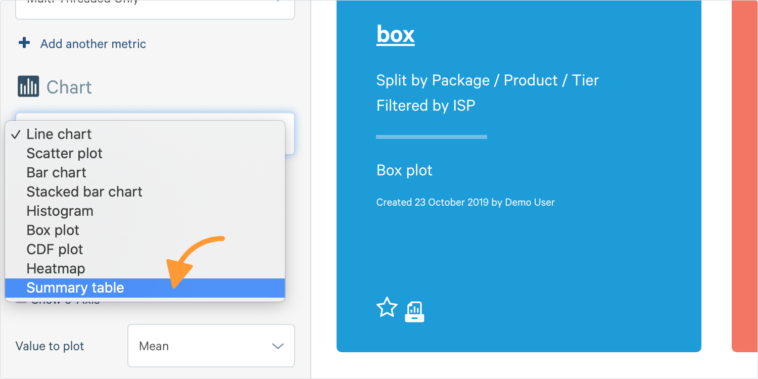
1. Go to the Chart Builder. In Analytics, select Summary Table in the chart section.
Tip: Bar charts can be relatively unhelpful unless filtered or split as it will just give you a single value. If you wish to visualise a summary table, bar charts be a nice option as they both aggregate across the entire selected data set in each data series (no time aggregation).
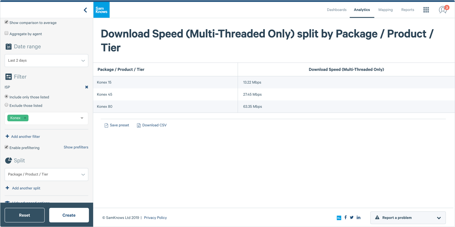
2. Complete the other options and click Create.
Plotting Different Aggregate Functions
Summary tables are great at displaying a lot of statistics side-by-side so it allows you to select which statistical functions you wish to be shown.
1. When you’re inside of Analytics looking at the chart builder, if you haven’t before, you’ll need to click Show Advanced Options.
2. Now if you’re building a chart then you’ll now see a field saying Table Columns. In this field you can select multiple columns (in same way as you would in a filter field), and they will be rendered in the order that they are in this select field.
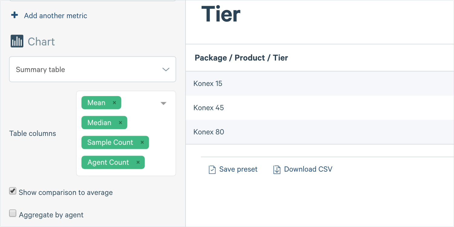
3. Click Create.