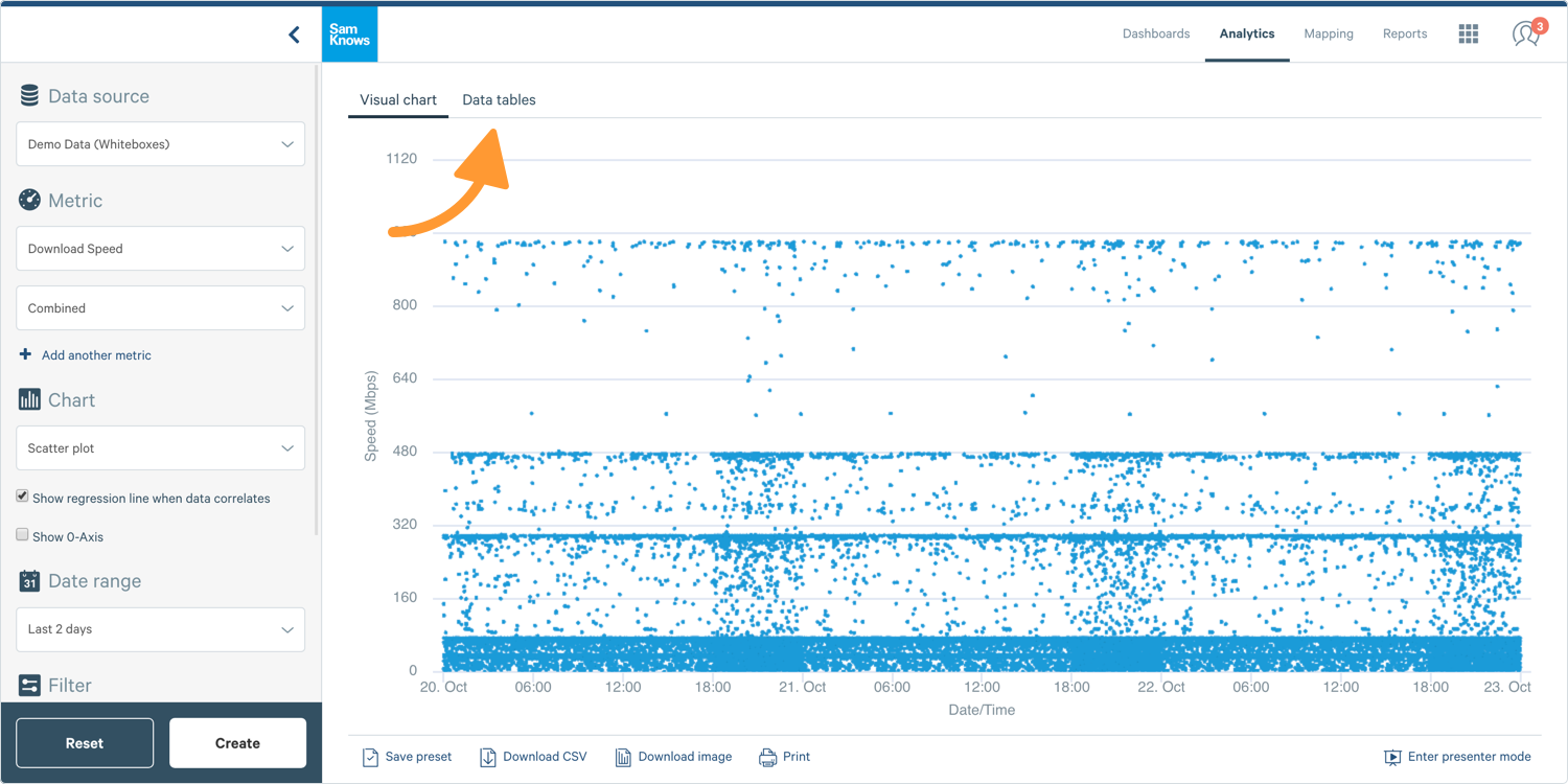
Using Scatter Plots
Governments; ISPs
This guide will show you how to create and use a scatter plot. Scatter plots allow you to explore your data in more depth than aggregate data.
Creating a Scatter Plot
Tip: Scatter plots displaying a lot of data can be very slow, or even crash your browser on less powerful computers. By applying filters to select the data that you need will make your life easier!
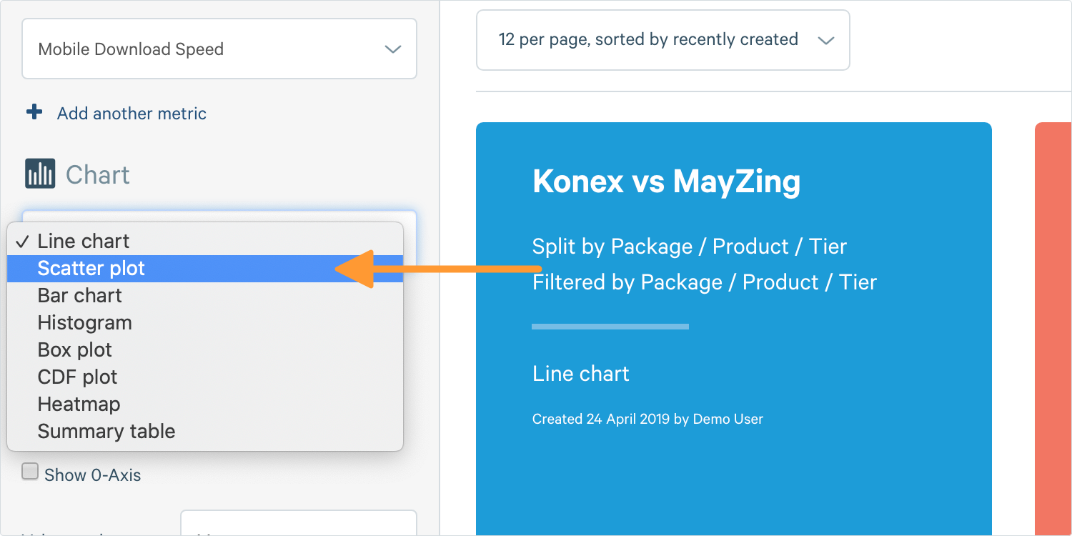
1. To create a scatter plot, go to the Chart Builder on the left-hand side of your screen. In Analytics, select Scatter Plot in the chart section.
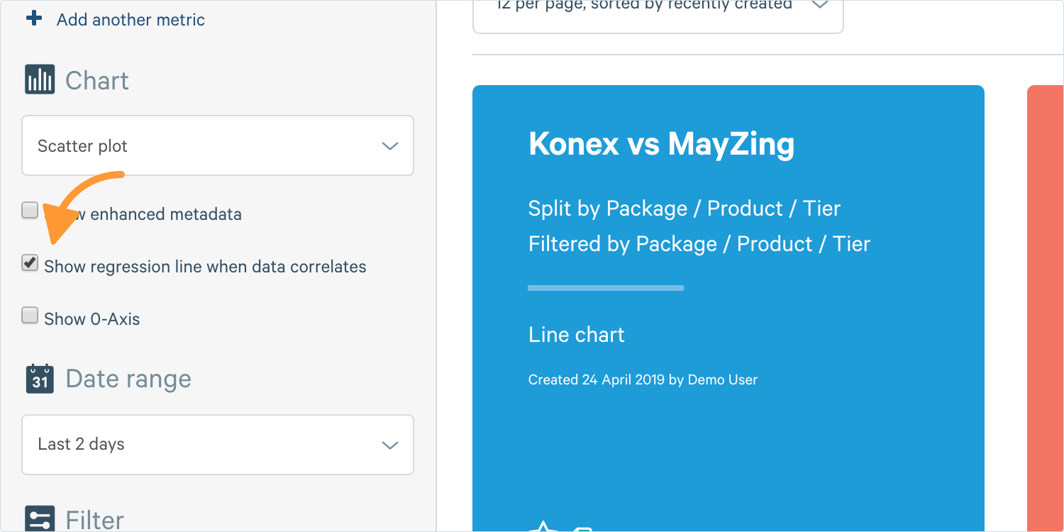
2. An additional option will appear, asking if you wish to show a Regression Line. This means it will generate the scatter plot, then if it notices a trend, it will draw a faint straight grey line to show you that trend (whether it be up or down).
Tip: Splitting is still available on scatter plots and will result in colour coding your points according to the data series they belong to.
3. Complete the other options and click Create.
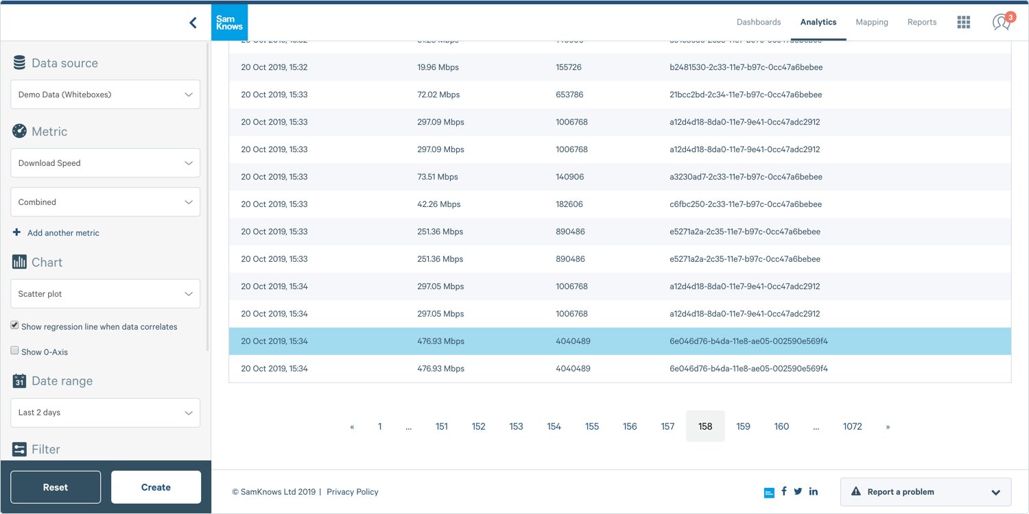
Data Tables
In addition to plotting your data as a visual chart, you can also create a table. Tables allow you to include additional aggregate functions.
1. Where you see Visual Chart at the top, click Data Tables and a table like this one will appear:
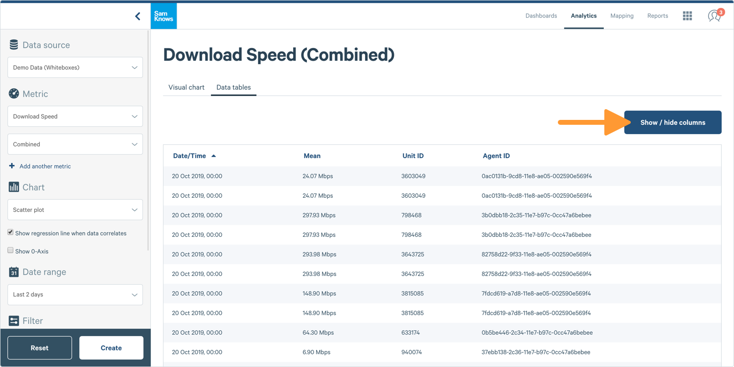
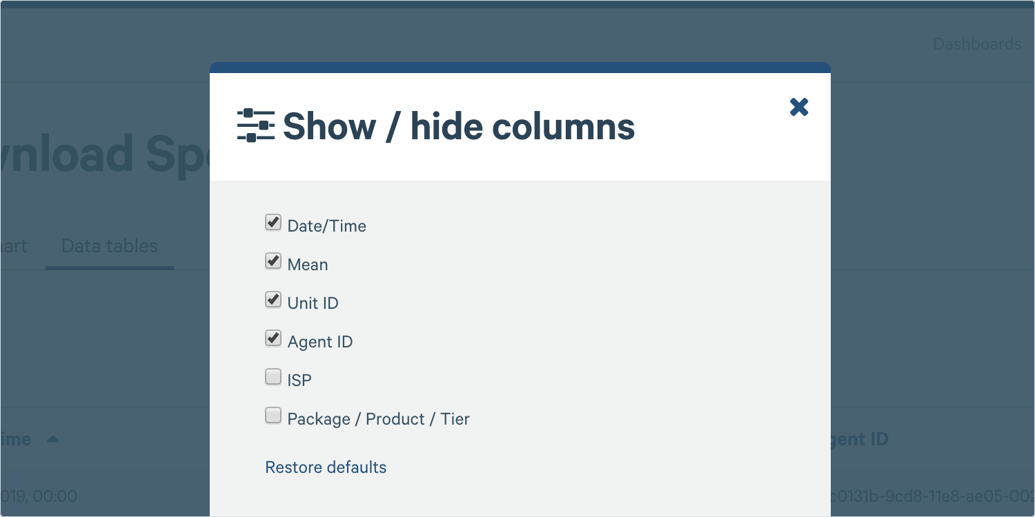
2. You can also click on the Show / Hide Columns button above your table to show additional information, such as Agent IDs.
Graph Inspection
Click on a single point on your scatter plot to dive further into the data for that particular point. You can use this function if you want to view metadata or the data that makes up an aggregate data point. In scatter plots, clicking a point will take you to a similar-looking scatter plot but with the information on hover, but also a shortcut to view the agent in agent administration.
1. Hover over a point and Click on the Point.
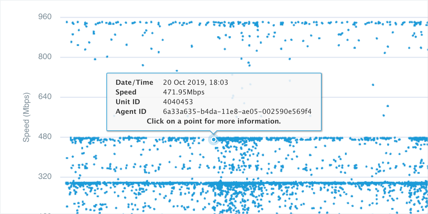
2. This will reveal more detail about that data point.