Using Box Plots
Governments; ISPs
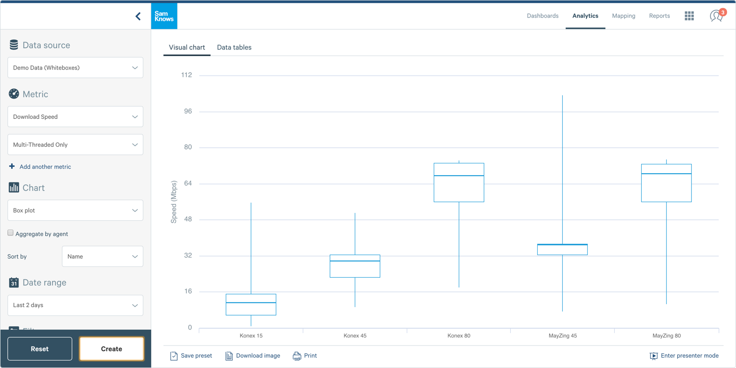
This guide will show you how to create a box plot. Box plots are useful for seeing the range of results, across the median, upper and lower quartiles, and the minimum and maximum of each data series.
Creating a Box Chart
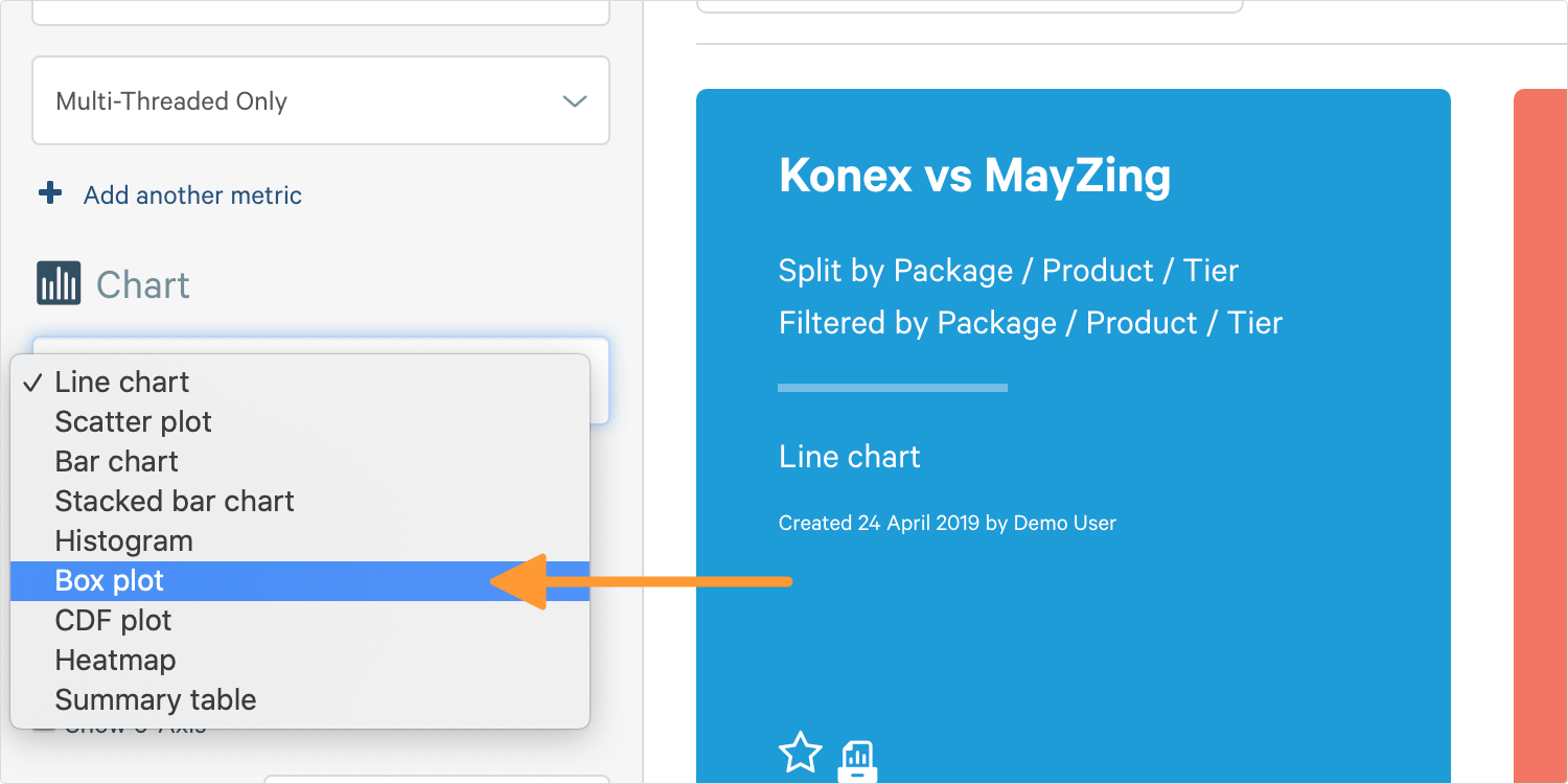
1. To create a box plot, go to the Chart Builder on the left-hand side of your screen. In Analytics select Box Plot in the chart section.
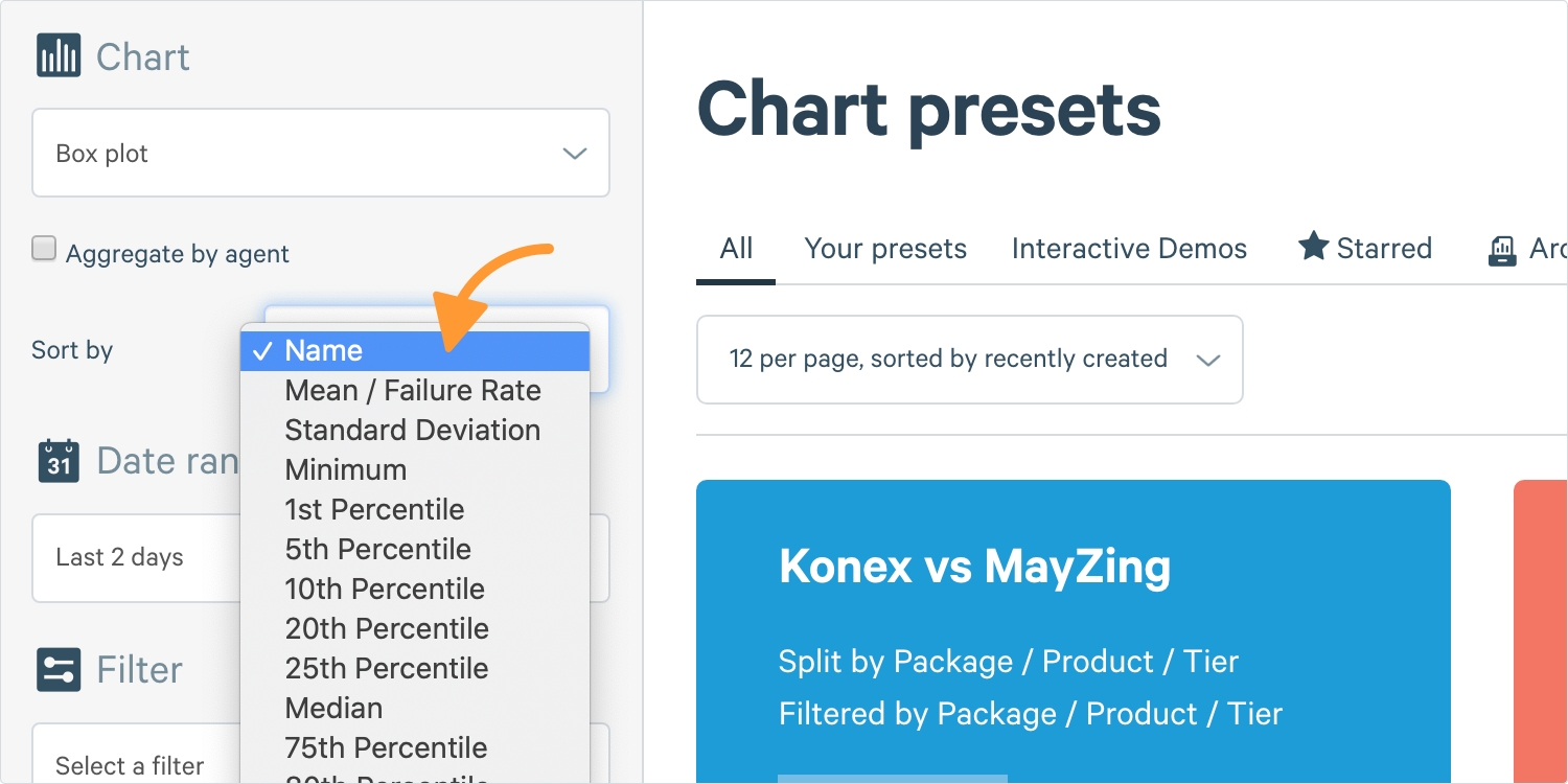
2. By enabling Show Advanced Options, you will see an option to arrange the bars. This allows you to modify the order of the box plots on the x-axis either by the data series name, or any various statistical aggregation.
3. Complete the other options and click Create.
Data Tables
In addition to plotting your data as a visual chart, you can also create a table. Tables allow you to include additional aggregate functions.
1. Where you see Visual Chart at the top, click Data Tables and a table like this one will appear:
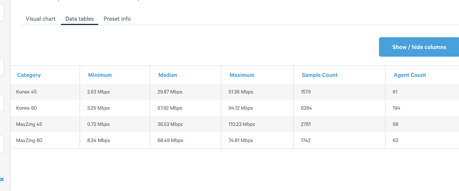
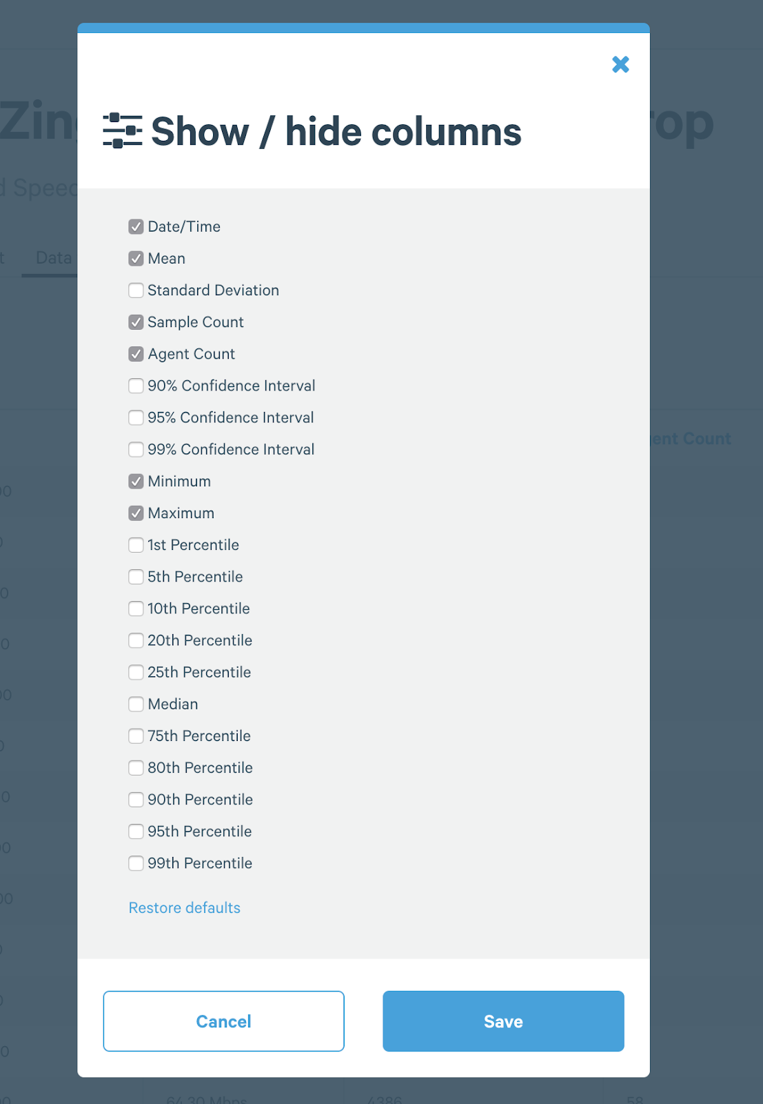
2. You can also click on the Show / Hide Columns button above your table to show additional information, such as Agent Count.