Using Charts
For Government regulators and ISPs
This guide will show you how to create charts, which make it easier for you to understand your performance data and quickly diagnose faults.
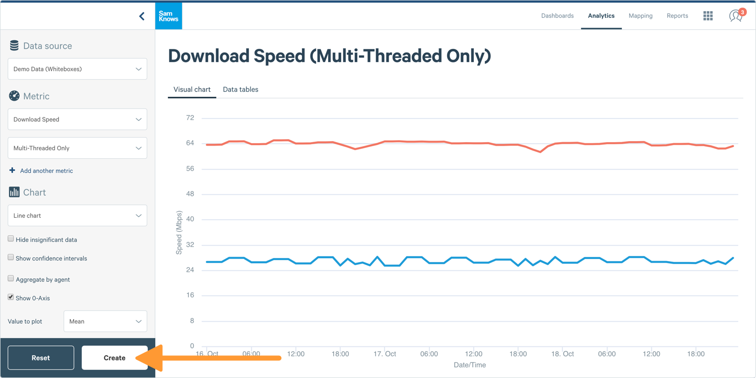
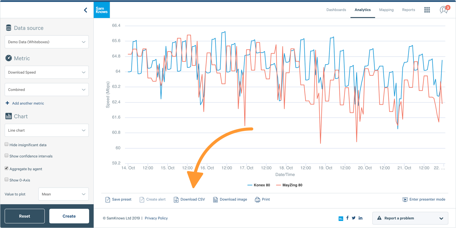
How to create a line chart
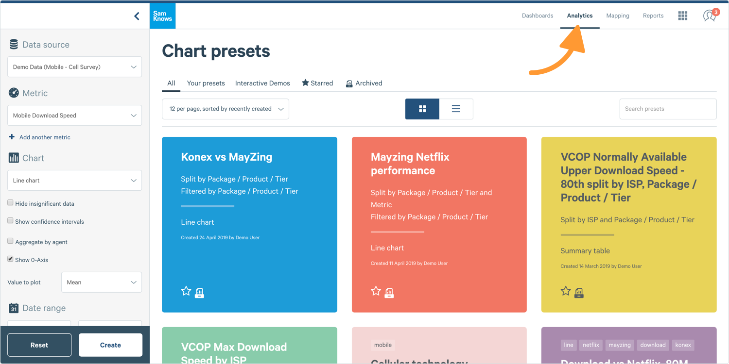
1. Log into ConnectedHome and select Analytics from the top navigation bar. You'll see the chart builder on the left and pre-saved charts on the right.
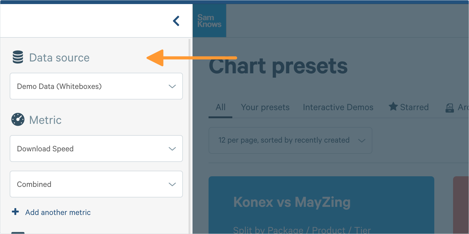
2. If you have access to multiple data sources then select the Data Source in the Chart Builder. If you only have one data source, you don’t need to do this.
Tip: Mobile, Whitebox, and CPE Agents are treated as different data sources.
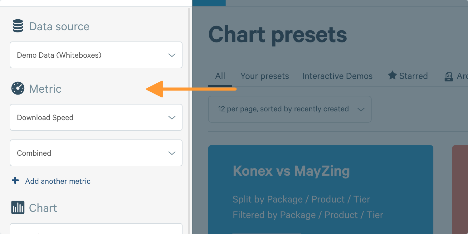
3. Next, select your Metric from the dropdown. You’ll see all of your subscribed metrics for all of the tests that are assigned to test schedules on your platform. Let's just leave ‘Download’ selected for now.
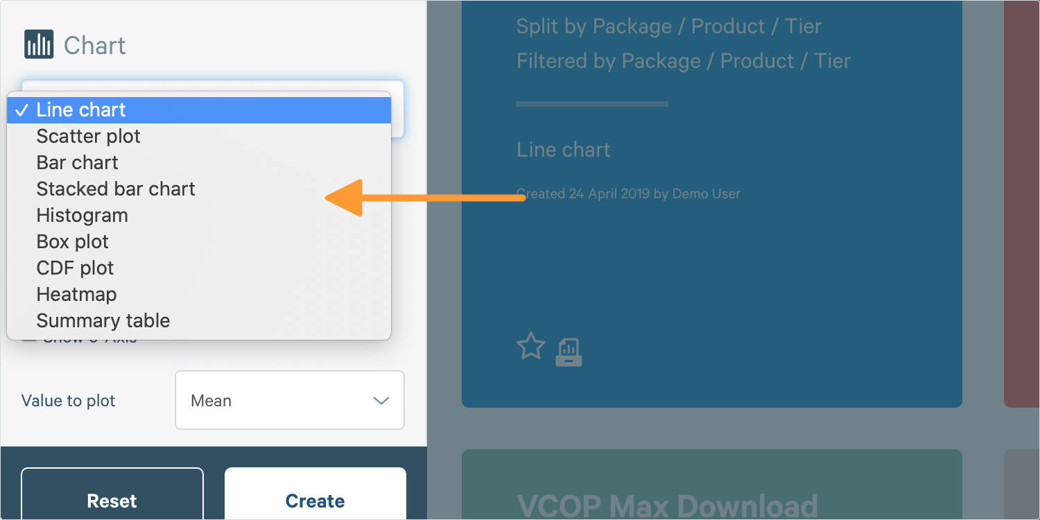
4. Next, you need to select the Type of Chart you want, select Line Chart.
5. Next we select a Date Range, I can choose one of the pre-defined options or customise the date range.
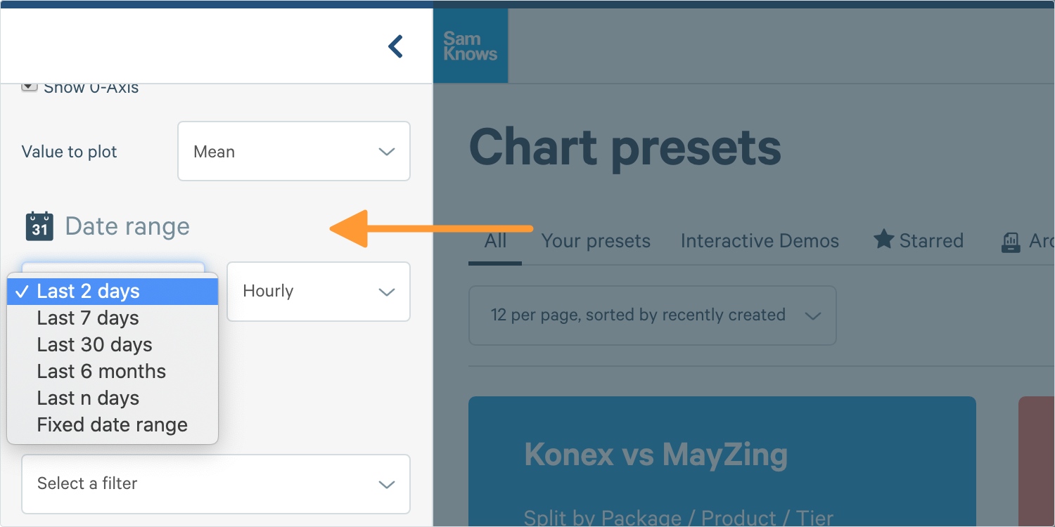
There are the Predefined Date Ranges:
- Last 2 days
- Last 7 days
- Last 30 days
- Last 6 months
Tip: If you use one of these or ‘last n days’ and save it in a preset, dashboard or report it will always display the most recent data. If you want a fixed period of time, use a fixed date range.
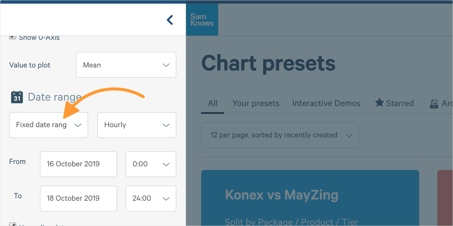
You can also specify a Fixed Date and Time Range, this won’t update if you save it as a preset and allows you to easily look at results in the past or a narrow window. You can also narrow down the range even further to specific times.
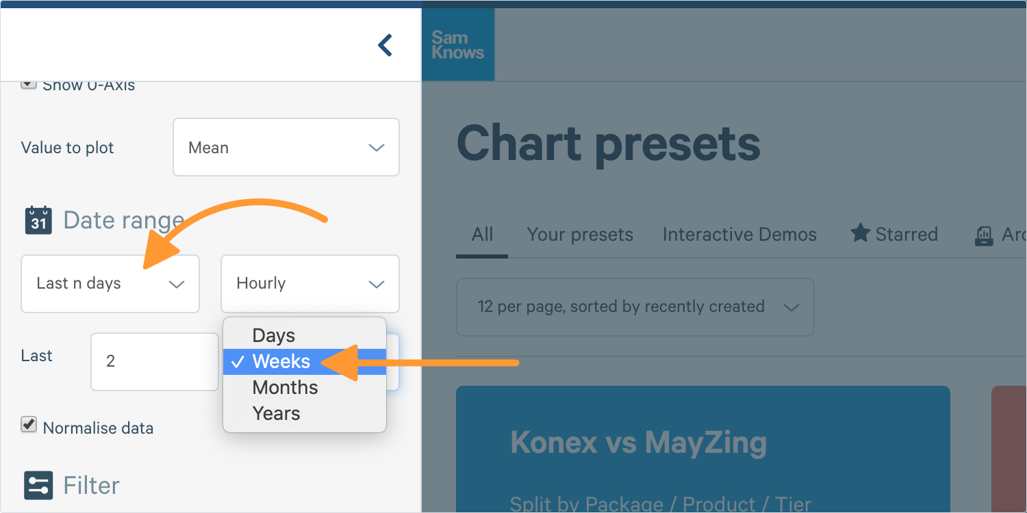
You can also select Relative Date Range, this means for presets it will always show the most recent data. You can set it to show the last few days, weeks, months or even years. This works the same way as the quick date ranges detailed above.
For now we’ll just stick with a predefined one and look at the Last 2 Days.
6. Now I select my Aggregation, this will be used for working out how much data to be aggregated into each point on my chart (Time is on the x-axis).
Tip: For example ‘Hourly’ would mean there would be 48 points on my chart’s line, an average speed for each hour in my time range, whereas with ‘Daily’ there would be 2 points, one for the average of each day.
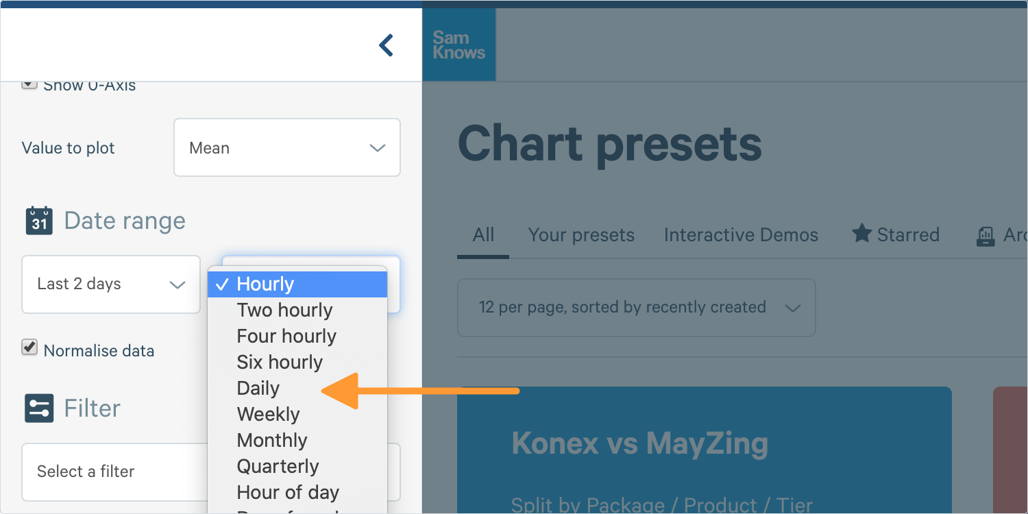
Tip: While most of these aggregations (Hourly, Daily, Weekly) will display time in order on the x-axis, others such as ‘Hour of Day’ will show you the hour (e.g. 4pm) on the x-axis and take all results between 4-5pm in the date range specified. This allows you to analyse things such as ‘the average week’ or ‘the average day’.
7. Next I can select my Filters to restrict the data shown on my chart.
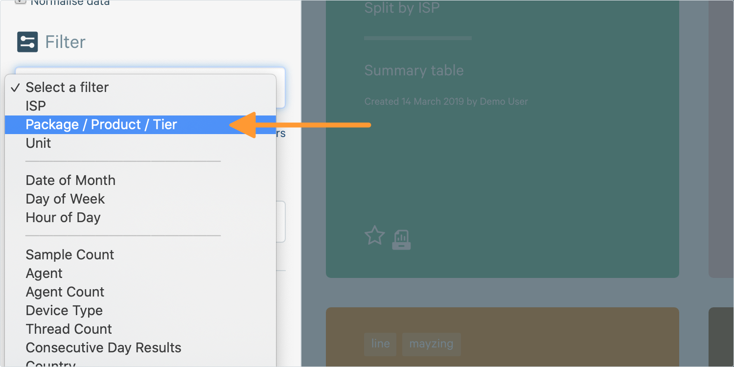
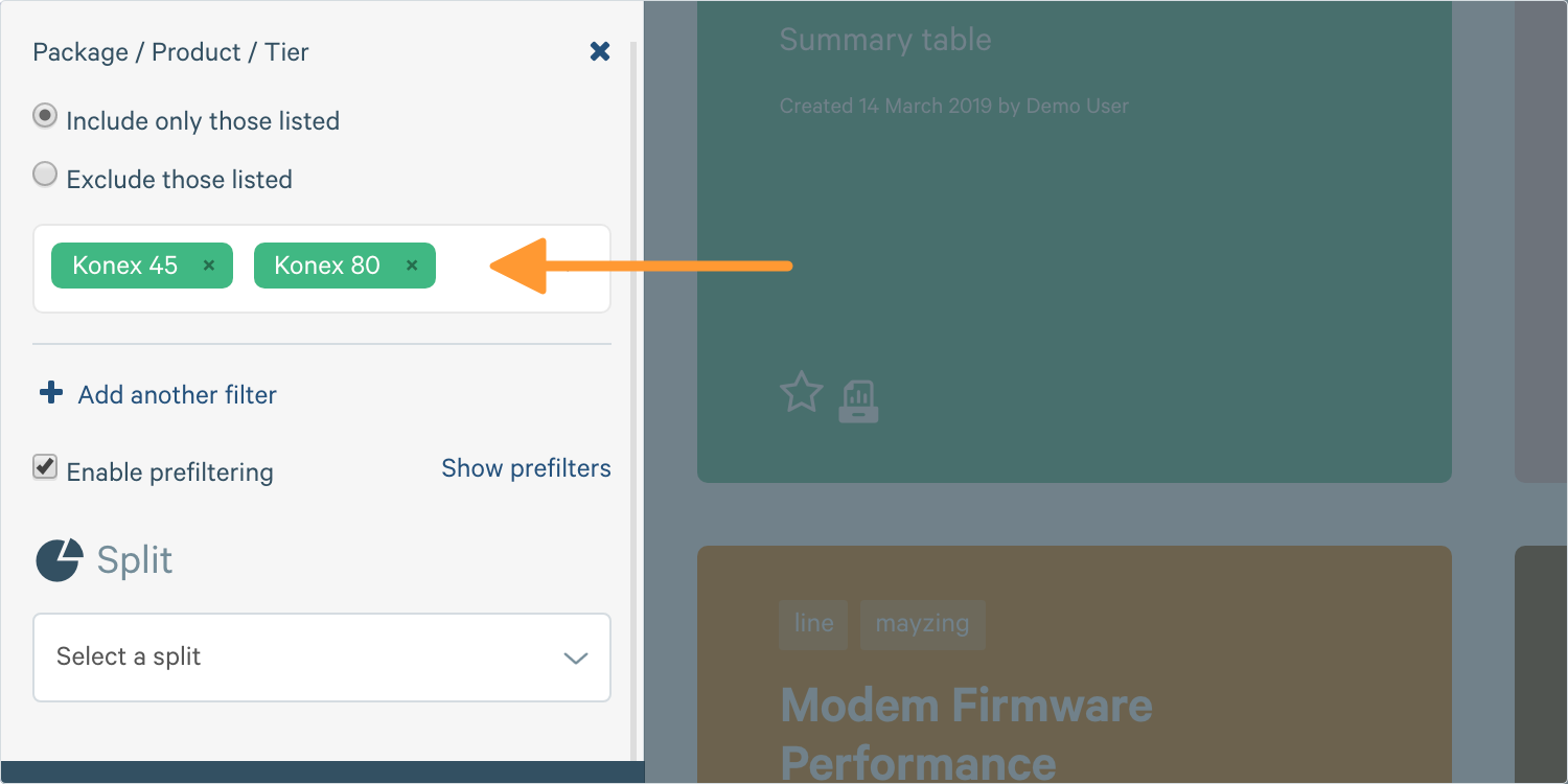
Most filters are ‘standard filters’, for example I might restrict it to only show two packages, Konex 80 and Konex 40.
This allows you select multiple different values and either set those to be the only values shown (include filter) or exclude those values (exclude filter). If there are tests/agents which have no value for this piece of metadata, they won’t ever be shown if you’re using an inclusion filter, but cannot be excluded with an exclusion filter.
Tip: You can specify as many items to include/exclude as you wish.
Depending on the filter it may provide auto-completion of values, in which case it will not allow invalid values to be used, or if no auto-completion is available (such as with targets) then you can enter any free text and just hit ‘Enter’ once you’re done. All entries must match exactly and the filter is case sensitive.
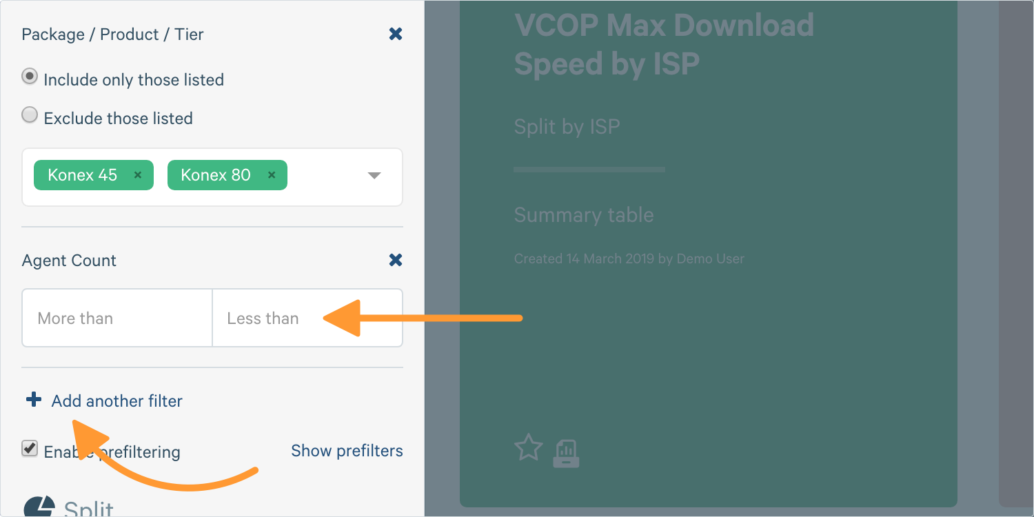
There are also a variety of range filters. Range filters typically accept two inputs, usually an upper and lower bound. Some examples are the metric value filters and agent count filters. But we will not be using this here.
Tip: You don’t have to enter two values, for example, if I entered 20 in the ‘More Than’ box it would filter down to results that are greater than, or equal, to 20. They are not strict inequalities so they will include the values specified.
Tip: I can use filters to either only include specific things, or exclude them. For example, I could say ‘show me all the packages except for Konex 45’ or I could say ‘just show me Konex 45’. This might be useful for example to exclude a faulty test server.
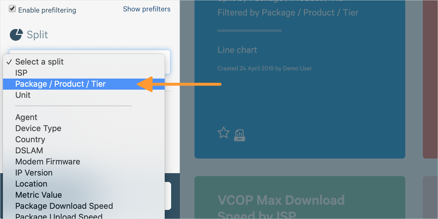
8. Finally, you can Split your Data. This means that data will be grouped into different lines on our chart so we can compare the two.
9. Click Create Chart and your chart will load on the right.
Tip: The bigger the sample (e.g. 100 agents versus 1000 agents), the smaller the range will be. Also, the range will be larger, the higher confidence (e.g. 99%) that you request.
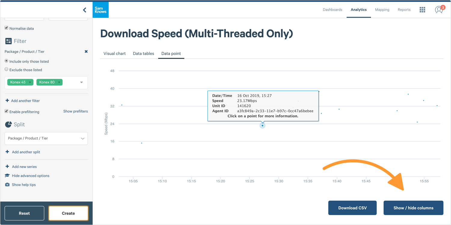
Graph Inspection
In line charts, graph inspection will show you all the raw data points forming an aggregate point, both as a scatter plot and as a table
1. Graph inspection is done by simply Clicking Whilst Hovering over a Point on a graph.
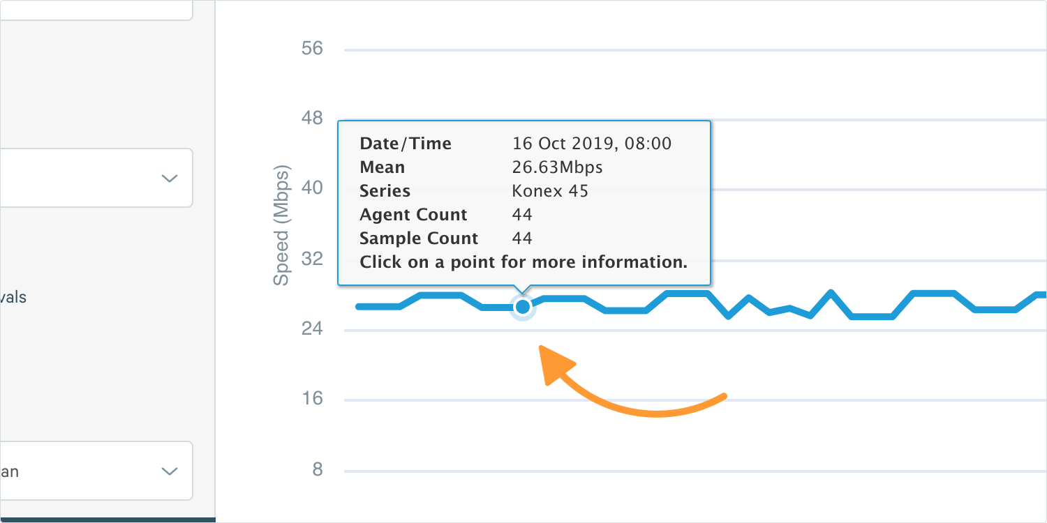
Tip: Clicking on points on most SamKnows graphs allows you to dive further into the data which can be very helpful if you want to view metadata or view the data making up an aggregate point.
2. This will then reveal a scatter plot and a table, using the ‘Show / Hide Columns’ option you can show extra fields such as Unit ID.
Confidence Intervals
Confidence intervals are important when trying to make statements and draw conclusions from data, this article we’ll have a look about how to see them in ConnectedHome. We can display confidence intervals on line charts and it will show as a range.
Check the option below the chart type that says Show Confidence Intervals.
4. This will then present you with a dropdown, this is where you can select the Confidence you want to be displayed. 90%, 95%, or 99%.
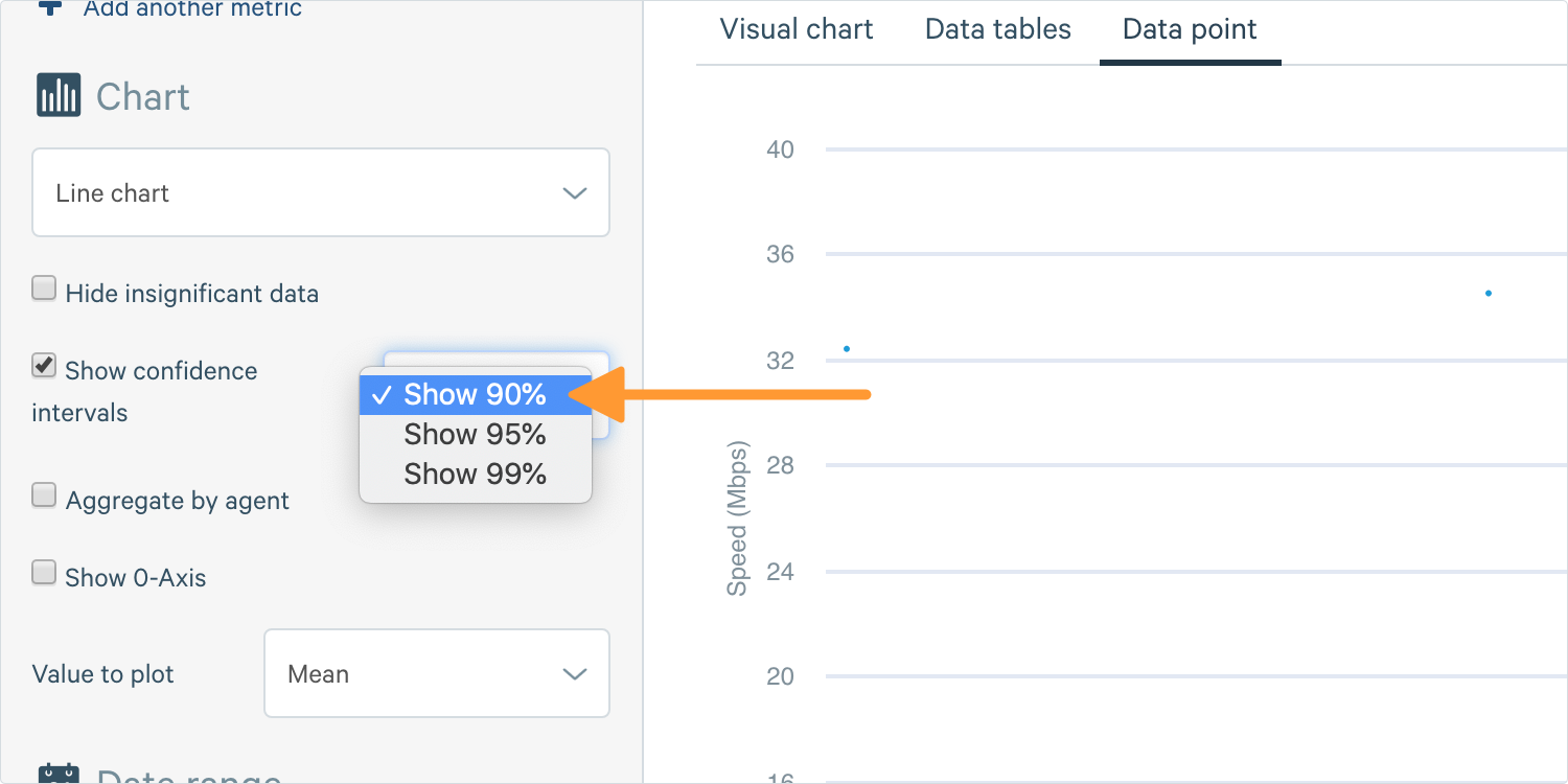
5. Then create your chart, on a line chart it will show it as an appropriately coloured shaded area; on a bar chart it will show as error bars.
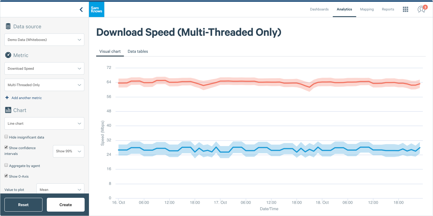
Tip: All SamKnows charting, when showing averages, will only be showing you the average of the tests that were run which is only a sample of your customers (the population). So whilst we can accurately tell you the average of the sample, what we cannot be sure about is the average of the population. This is what confidence intervals are for. They provide a range, and a confidence to that range, that if you had an average of the entire population of consumers/agents, it would sit in that range. Confidence intervals are vital for drawing statistically-valid conclusions and statements from data when doing sampling.
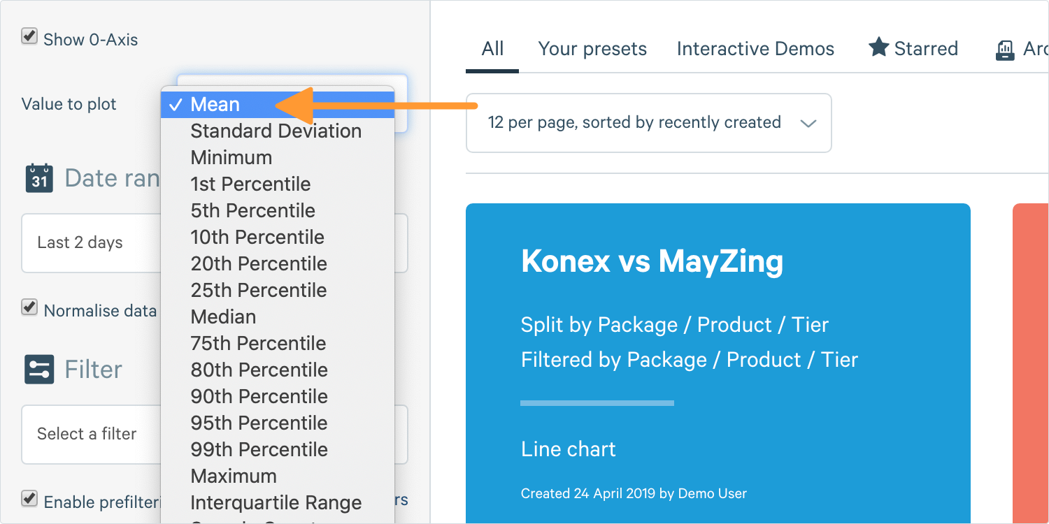
Plotting Different Aggregate Functions
It can be useful on line charts to plot other statistics than just the mean average.
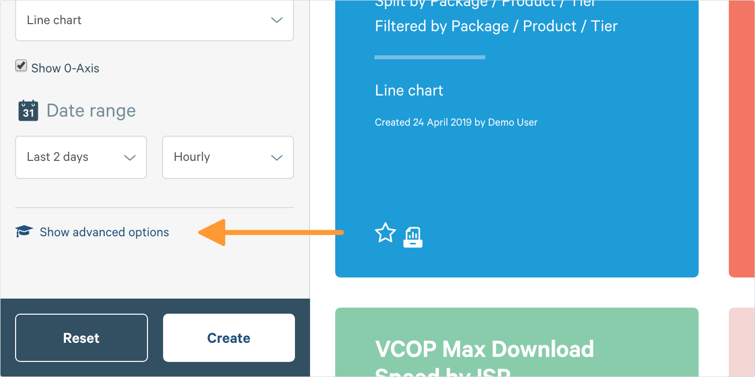
1. When you’re inside of Analytics looking at the chart builder, if you haven’t before, you’ll need to click Show Advanced Options.

2. Now if you’re building a chart then you’ll now see a field saying Value to Plot, you can now select what exactly you want to be plotting on your chart.
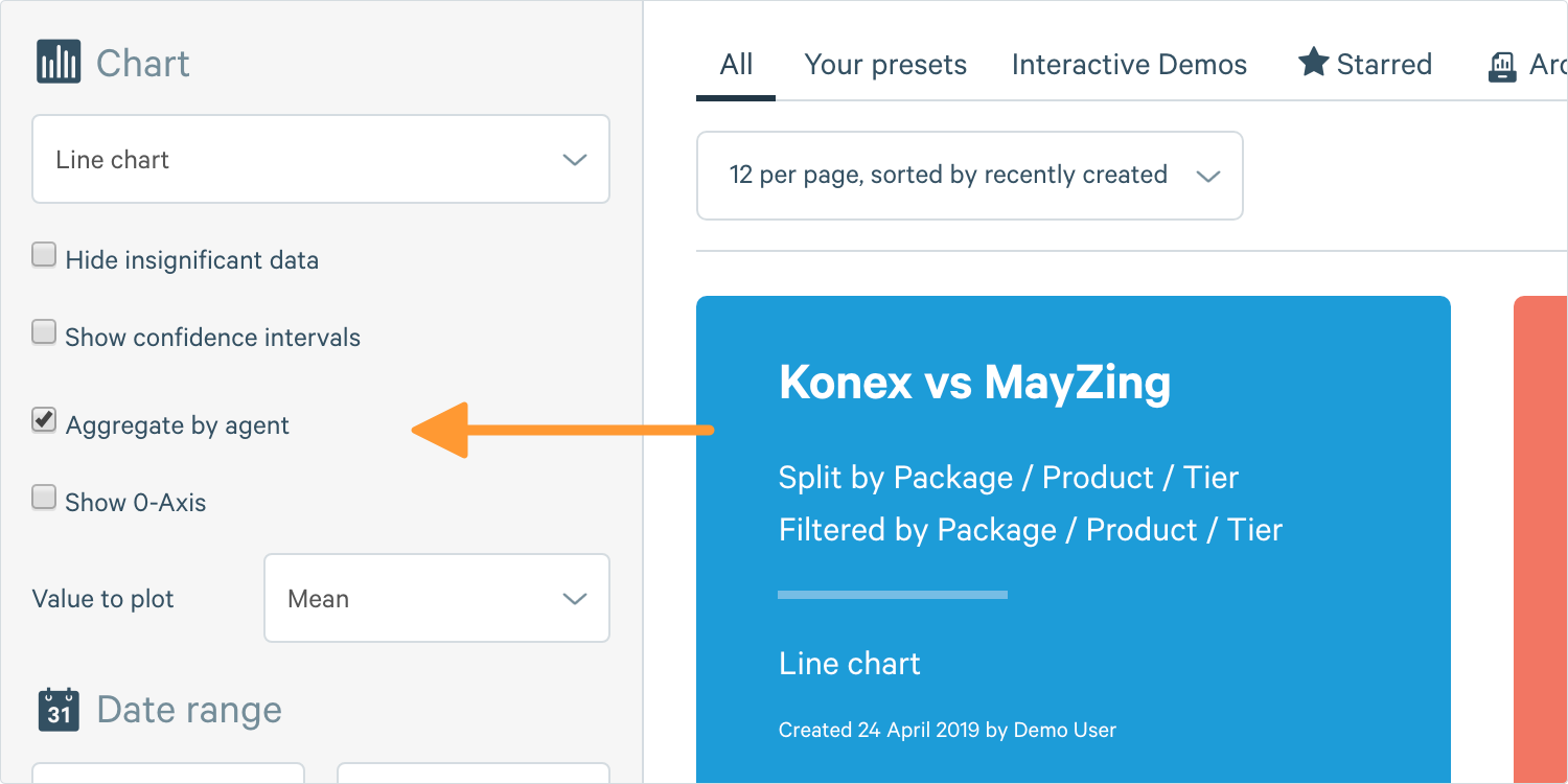
Agent Aggregation
By default ConnectedHome will always aggregate over all the test results but often it’s a requirement to aggregate by agents first, let's look at how.
When you aggregate by test, it’s useful if you just want to see an overall average of all the test results in each bucket (where a bucket in an hourly chart would mean each hour) but if one agent reports more often than others, this could lead results to be skewed. In order to get around this, you can average all the results by one agent in each bucket first, then take the average of those agents.
Tip: Some metrics such as VCOP and consistency metrics require aggregation by agent first and do more than just ‘average’ at each level, for example consistency metrics take percentiles of each agent, then percentiles of those percentiles. You cannot disable agent aggregation on these metrics.
1. When you’re inside of Analytics looking at the chart builder, if you haven’t before, you’ll need to click Show Advanced Options.
2. Check the option below the chart type that say Aggregate by Agent
Exporting data
When viewing a chart you may want to export the data it’s showing you in order to put it into other systems or share it with others. Exporting data as a CSV allows you to do just that.
1. Firstly, lets bring up a chart that we want to export.
Tip: Almost every chart type can be exported as a CSV; the exceptions being box plots and bar charts, if you wish to export that data, please export a similar CDF or summary table.
2. Below the chart and legend you’ll see a series of options, to export the data as a CSV, simply click Download CSV.
Tip: If you’re exporting larger amounts of data, it will be faster for you to use the Data Exports section of ConnectedHome. View an article on how to use that functionality here.
Normalisation
Users can optionally enable a feature called Normalisation when using time series line charts. This is useful when plotting results by hour, but the test schedule does not run test results every hour across every agent. Without normalisation, users will often see a saw-toothing effect, with some hours having measurement agents with much better results than other hours.
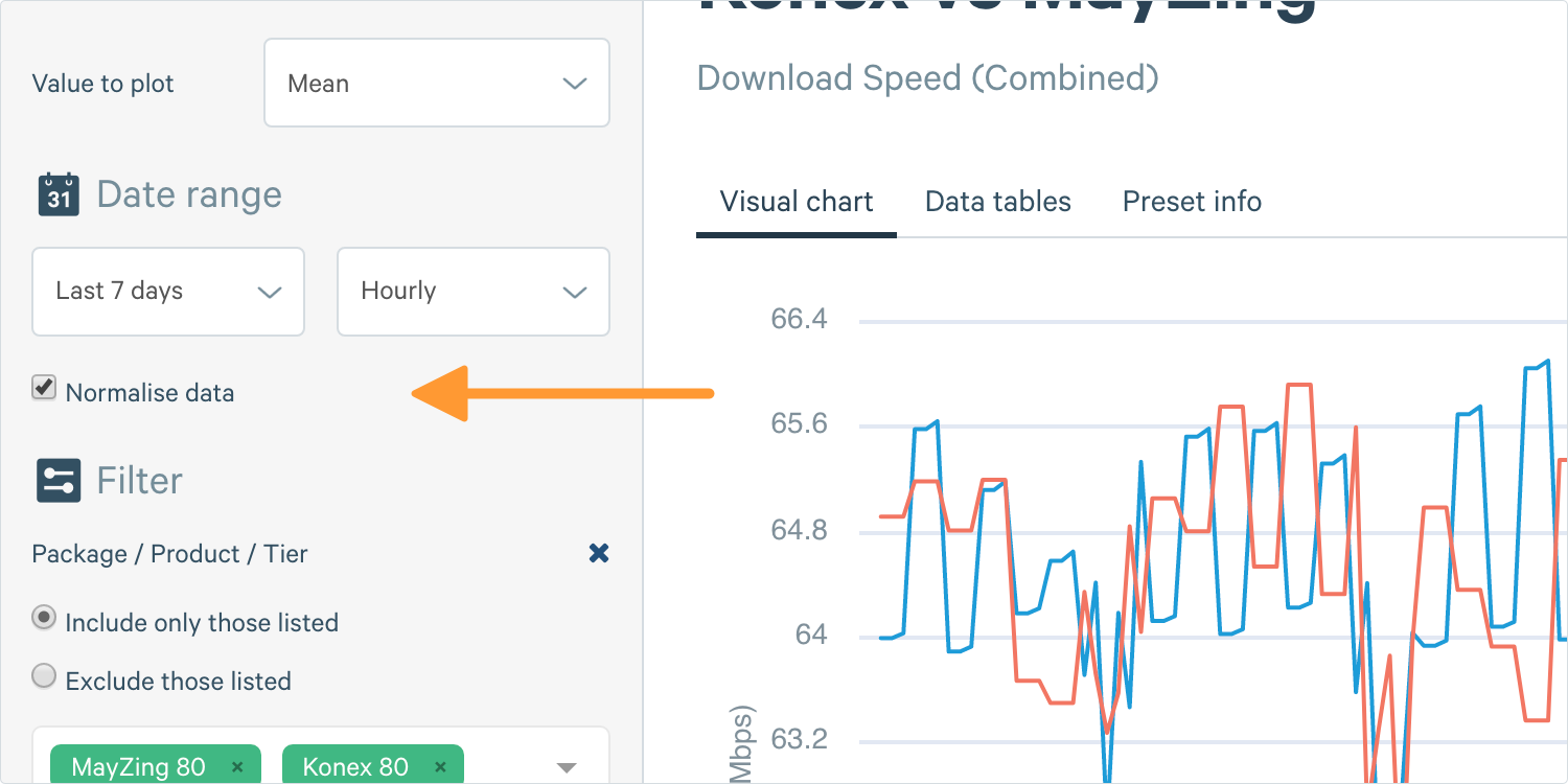
Tip: Normalisation can often cause confusing results, for example you may filter down to a single unit which tests once every six hours, but the graph would show a point every hour.
Normalisation forces ConnectedHome to look at the underlying test schedule for the metric in question, and to normalise results across the blocks of hours that the tests should run over. This results in an even number of measurement agents and results being represented for all hours of the day, thus removing the spikes in the charts and making it easier to see overall trends.
What actually happens behind the scenes for normalisation is after all filters have been applied, it will look at the test schedule of each individual unit. If a unit runs a download test once every 6 hours between 6am and 6pm for example, and runs two tests at 8.37am and 2.37pm then it would duplicate the 8.37am result into every hourly bucket between 6am and 11am, and duplicate the 2.37pm result into every hourly bucket between 12pm and 6pm.
If you want to see accurate results on an hourly basis, disable normalisation. If you want to make a graph easier to read and see trends, enable normalisation.
Tip: Normalisation is only available on hourly, hour of day, two hourly, four hourly and six hourly aggregations.
Tip: You can enable or disable normalisation in the chart builder in the date range section.

