Using Bar Charts
Governments; ISPs
This guide will walk you through how to use bar charts, which provide a quick way to compare the averages, or other values, of different data series. The y-axis shows the value being plotted, and the x-axis displays the data split that each bar represents.
Creating a Bar Chart
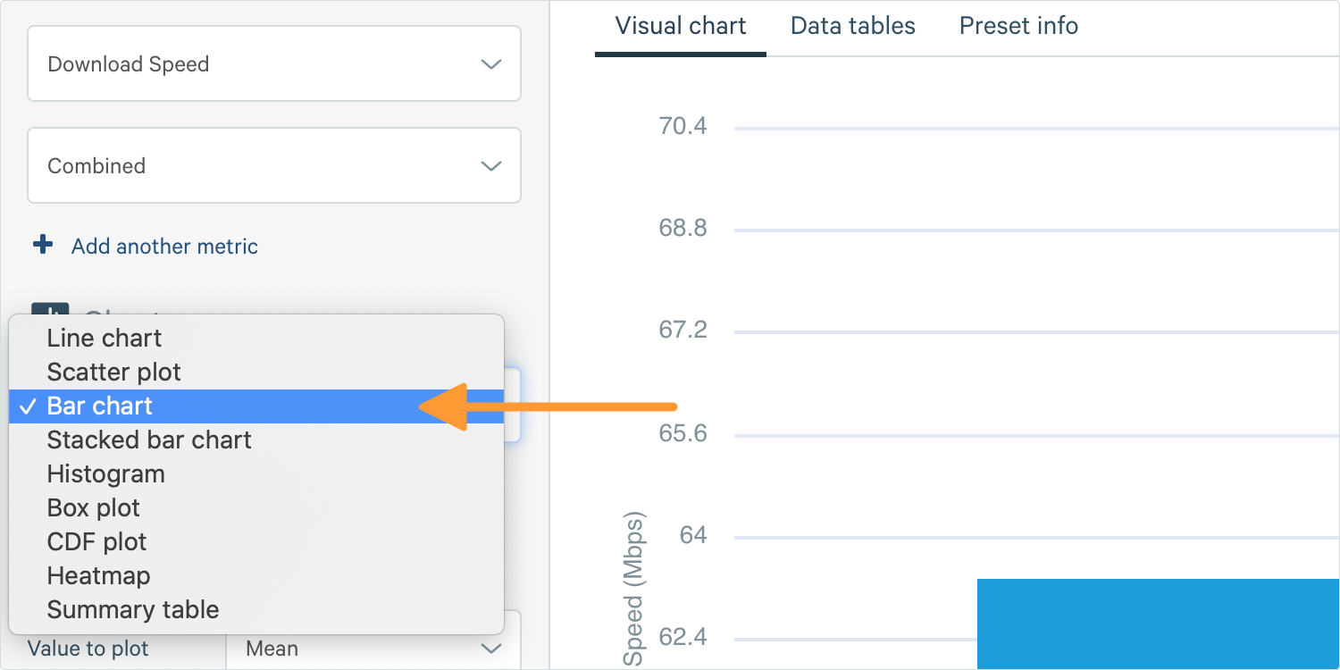
1. To create a bar chart, go to the Chart Builder on the left-hand side of your screen. Scroll down to Analytics and select Bar Chart in the chart section.
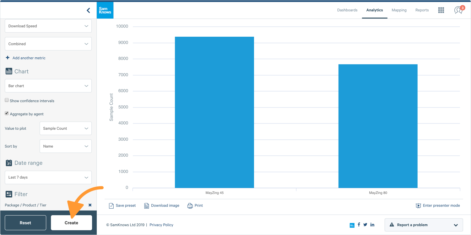
Tip: To make the most of your bar chart, filter or split the data to see more than one bar.
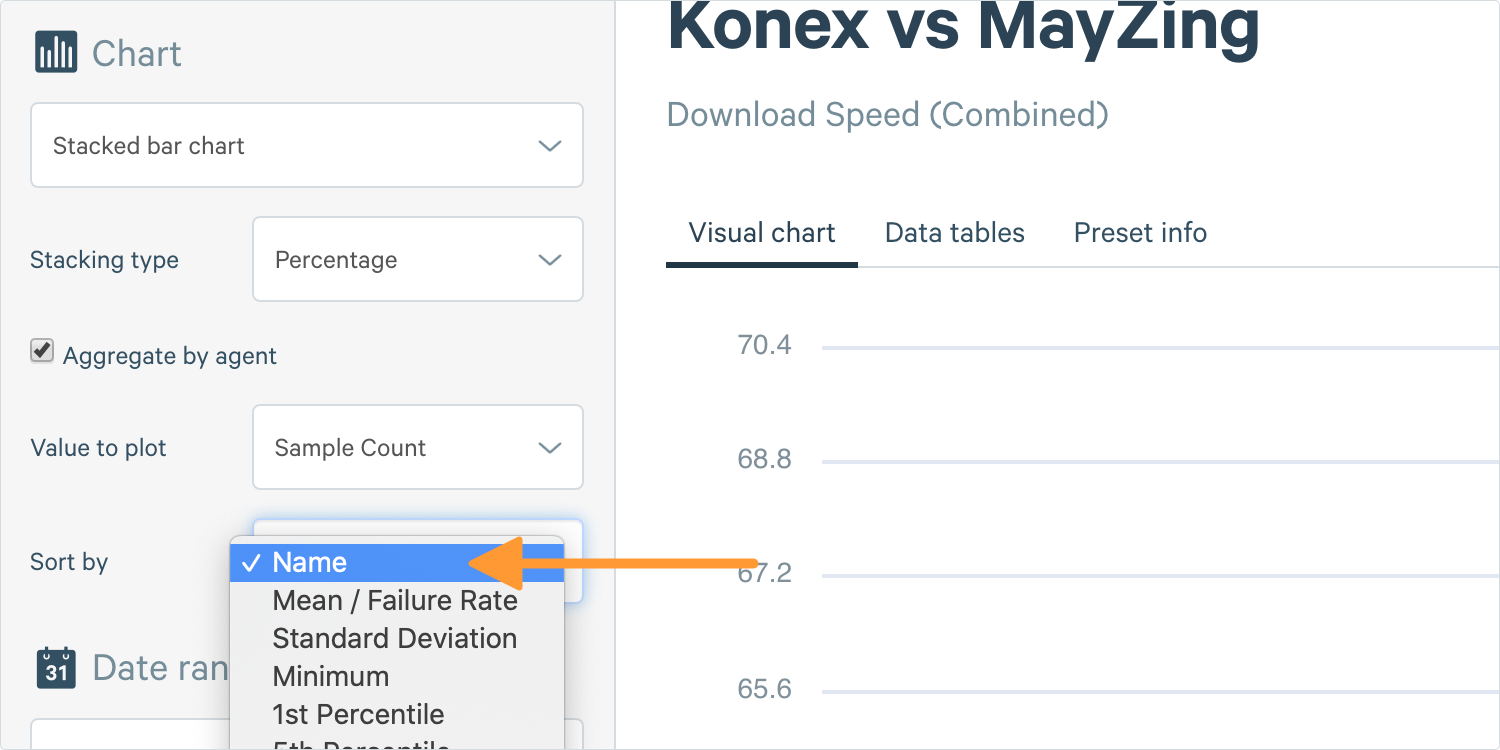
2. Enable Show Advanced Options to choose how you wish to split your data. Select an option in the drop-down selector box next to Sort By and modify the order of the bars on the x-axis, either by the data series name or any statistical aggregation.
3. Complete the other options and click Create.
Tip: To view more information about creating basic charts, see 'Using Basic Charts’
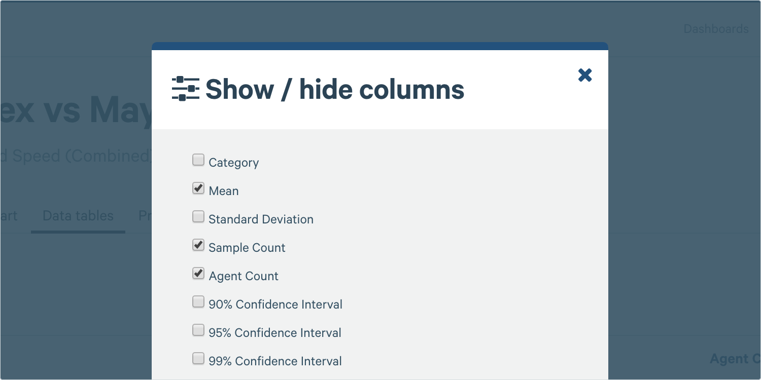
Data Tables
To see a table of all the points on your graph, select the Data Tables tab. Here, you can also view aggregate functions outside of what you're plotting on the chart, along with their average.
1. Where you see Visual Chart at the top, click Data Tables and the following table will appear.
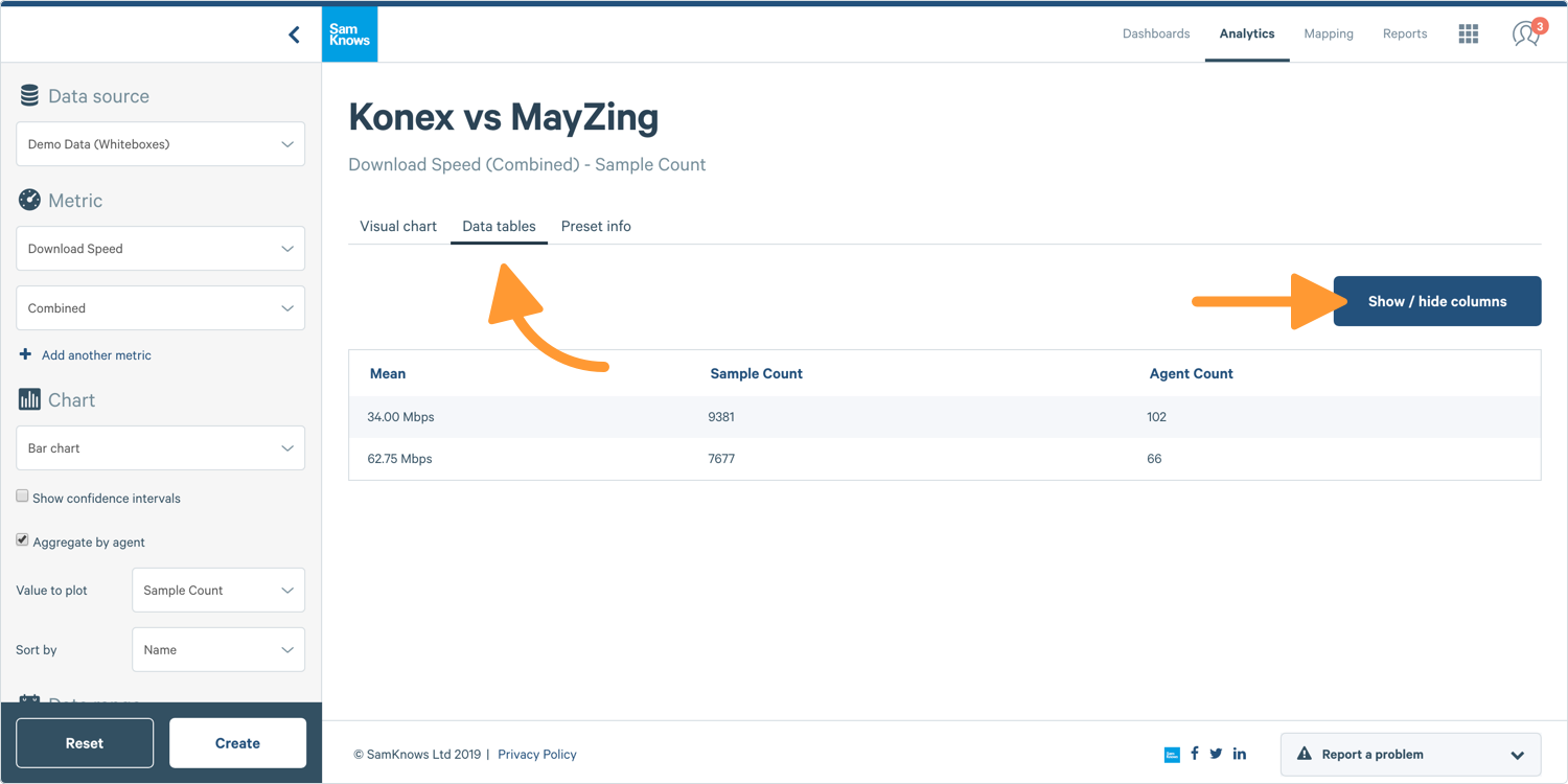
2. You can also use Show / Hide Columns to show additional statistical functions on the same aggregate point.
Confidence Intervals
Confidence intervals show you to what extent the results are statistically valid, and are useful when making statements and drawing conclusions from the data. You can display confidence intervals on bar charts in ConnectedHome, which will show as error bars.
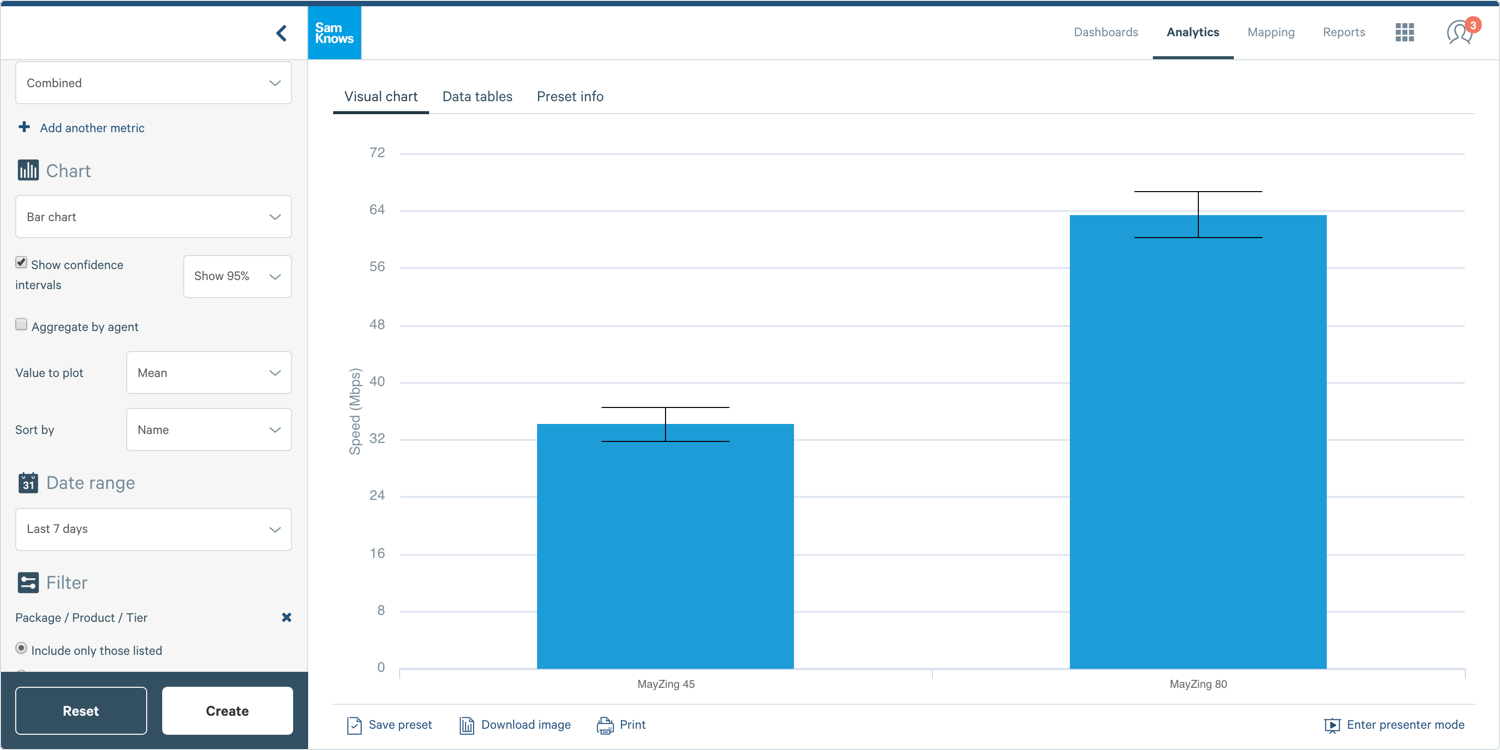
1. Check Show Confidence Intervals below the chart type in the Chart Builder.
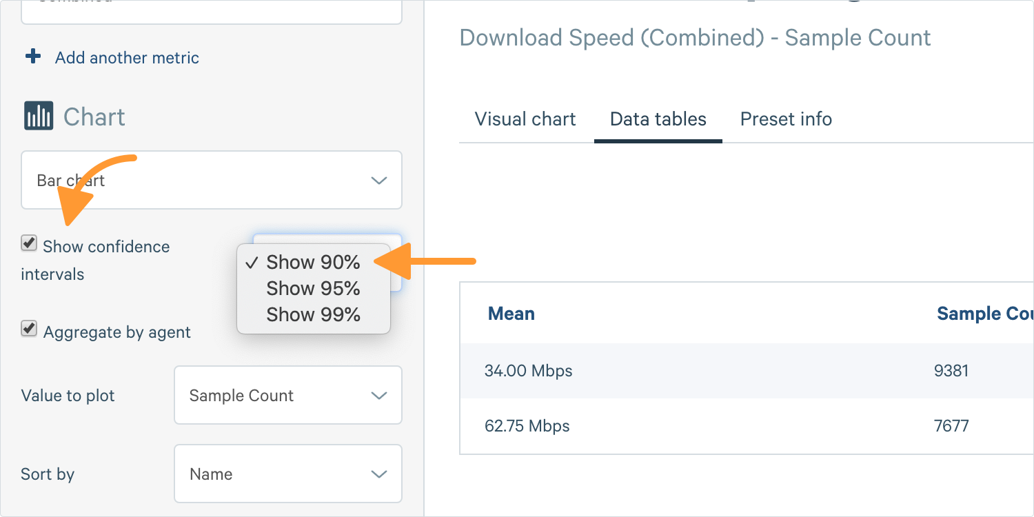
2. You will then see a dropdown. Select the confidence you want to display: 90%, 95%, or 99%.
3. Create Your Chart! Your confidence interval will appear as a shaded area around the line on your line chart; a bar chart will show your confidence interval as error bars.
Tip: For more information about confidence intervals, see 'Using Confidence Intervals'.
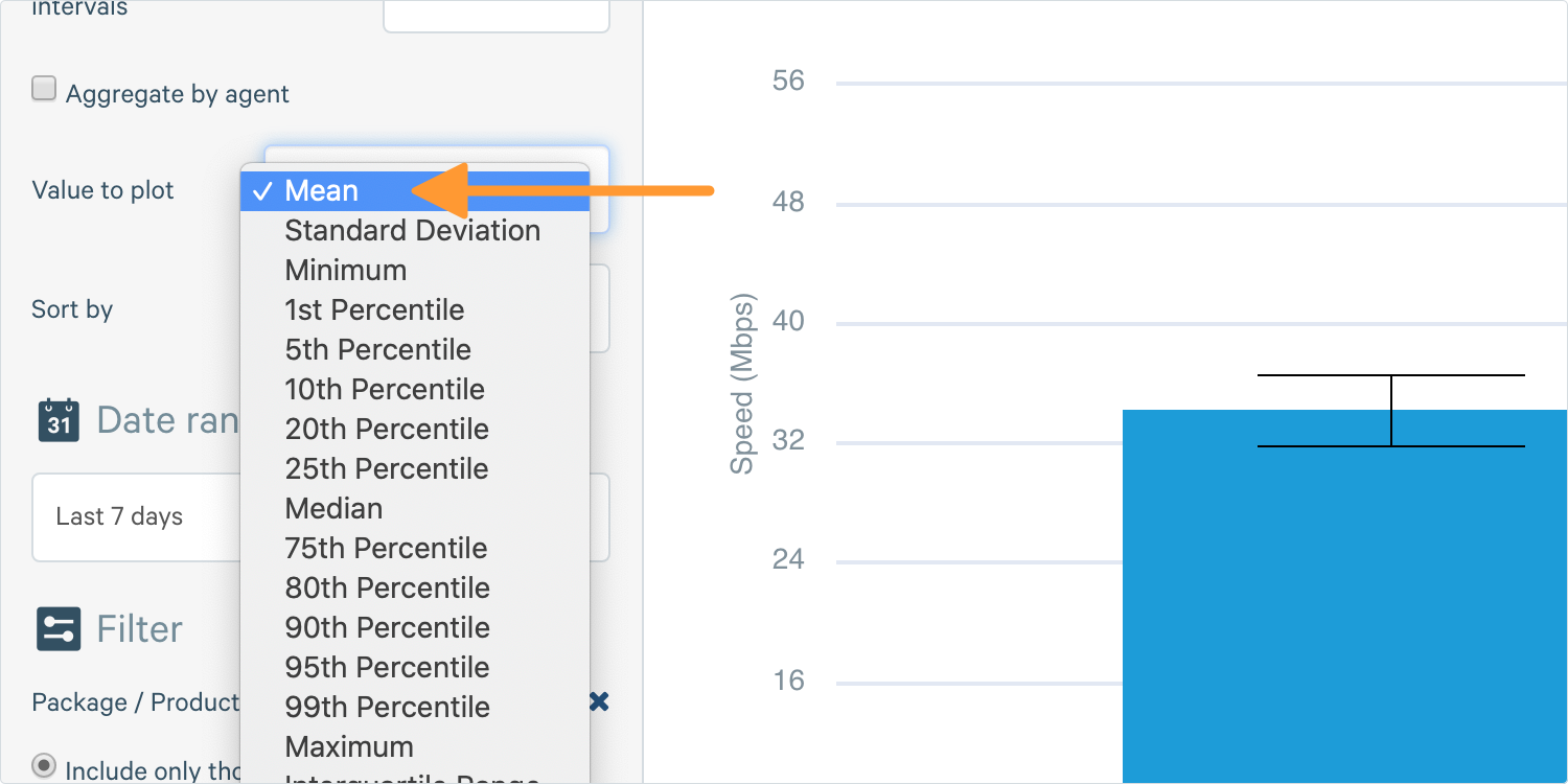
Plotting Different Aggregate Functions
ConnectedHome offers a variety of aggregate functions for you to analyse your data.
1. Go to Analytics in the Chart Builder and click Show Advanced Options.
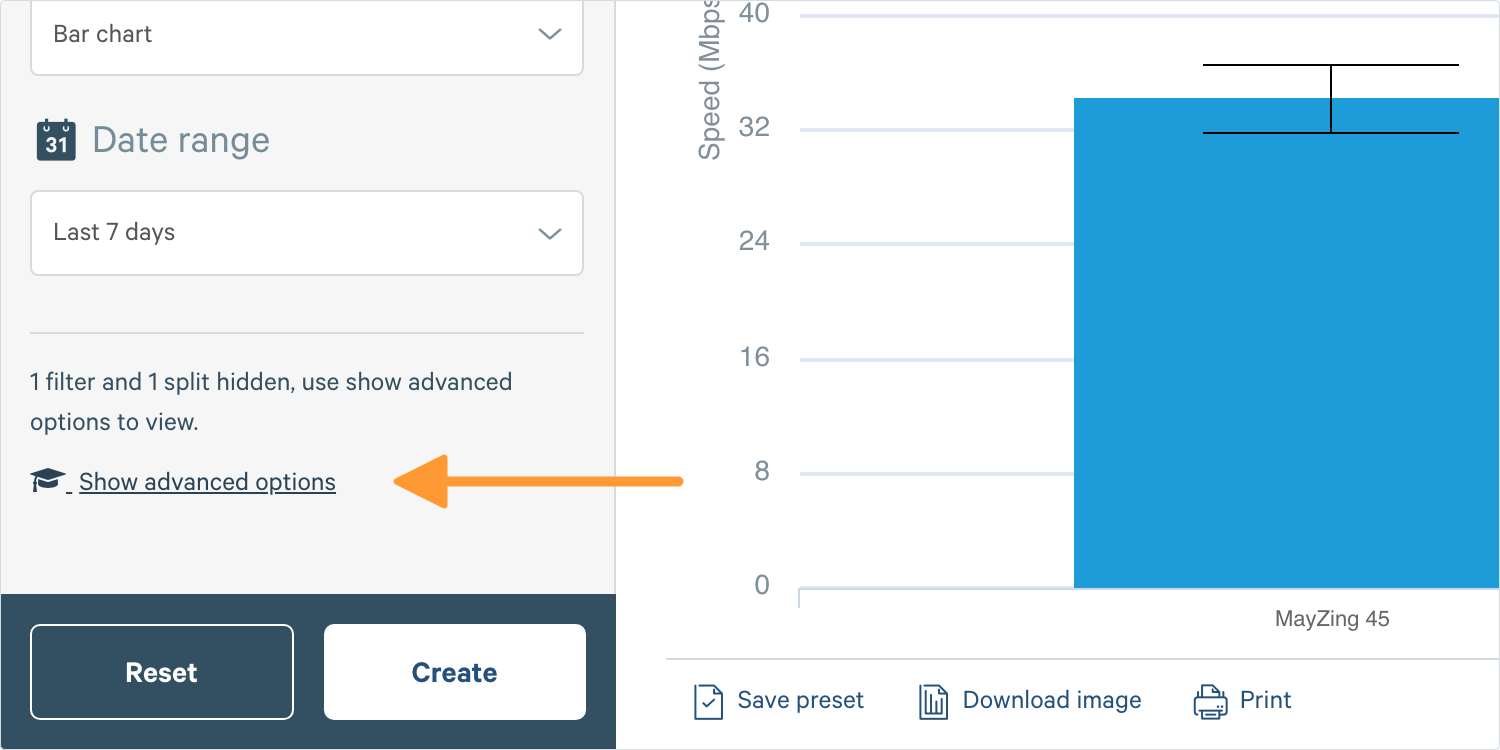
2. You will then see a field saying Value to Plot, where you can choose what you want to plot on your chart.
Tip: For more information about plotting different aggregate functions, see 'Using Plotting'.

